Skip to content
Home
Services
Work
About
Insights
Blog
Webinars
Guides & Tools
Our Partners
BigCommerce
Klaviyo
Salsify
SCAYLE
Shopify
Contact
Home
Services
Work
About
Insights
Blog
Webinars
Guides & Tools
Our Partners
BigCommerce
Klaviyo
Salsify
SCAYLE
Shopify
Contact
Contact Us
Thought
Leadership
Categories
AI
BigCommerce
Brand
Client Resources
Content Marketing
CRO
Email Marketing
Marketing
News
Paid Media
SEO
Social Media
Strategy
Uncategorized
UX
Website
All
Search
Search
AI
,
Website
Your Website Wasn’t Built for AI And It’s Costing You Traffic
CRO
,
UX
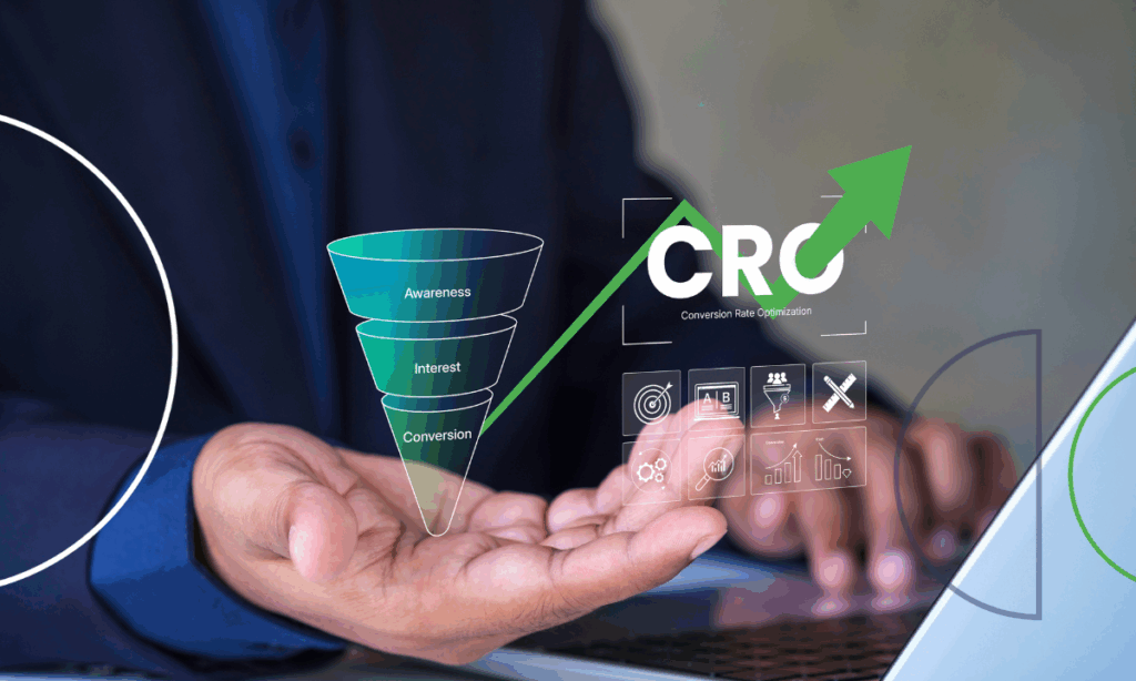
CRO vs. UX Optimization: Which Impacts Conversions More and Where to Put Your Money in 2026?
Uncategorized
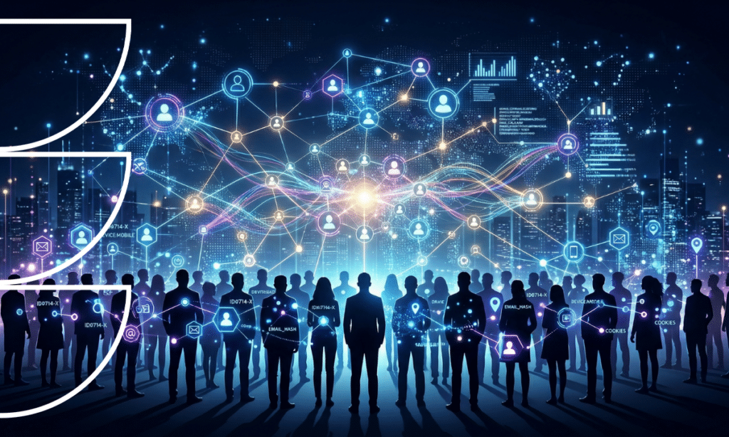
The 97% Problem: Why Identity Resolution Is No Longer Optional for Ecommerce Brands
Client Resources
How We Run Campaign Planning at LimeLight Marketing
Client Resources
Clients We’re Not the Right Fit For
Client Resources
What’s It Going to Be Like Working With LimeLight?
Paid Media
Creative Is the New Targeting: What Ecommerce Brands Need to Know About Social Ads in 2026
Marketing
The Cost of Waiting: What Delayed Marketing Decisions Cost Brands
Website
How Website Support Retainer Hours Actually Work
Marketing
,
Strategy
,
Website
Why We Often Recommend Starting with Discovery
Website
What to Expect in a Custom Web Development Partnership
Marketing
,
Paid Media
Google AI Is Changing Ecommerce: When Search Becomes the Checkout
Social Media
How Ecommerce Brands Use Pinterest to Drive Traffic & Sales in 2026
Marketing
,
Strategy
eCommerce Marketing Blog: Trends, Tools & Insights
Marketing
eCommerce Agency vs. In-House Marketing: Which Is Right for You?
Strategy
eCommerce Analytics Agency That Drives Smarter Growth
CRO
,
Website
eCommerce Website Design & Conversion Optimization Agency
Marketing
,
Strategy
10 eCommerce Marketing Strategies That Drive Growth in 2025
Marketing
,
Strategy
How to Choose the Best eCommerce Agency for Your Brand
Marketing
,
Strategy
Real Results: eCommerce Case Studies from LimeLight Marketing
Marketing
Free eCommerce RFP Template to Help You Hire the Right Agency
Marketing
How Much Does an eCommerce Agency Cost in 2025?
News
10 Years in the LimeLight: Reflections from a Founder
Paid Media
What’s Working in Paid Media: Creative Cadence, First‑Party Data, and Automation for Ecommerce Growth
CRO
,
Website
The CRO Science of Microcopy: One Word, Real Money
CRO
,
Website
The PLP and Search CRO “Speed Stack”
CRO
,
Strategy
Speed Over Perfection: How Micro‑Experiments Compound Ecommerce Growth
Strategy
,
Website
The eCommerce Marketer’s Guide to Connecting Customer Data to Meta & Google Ads
Strategy
,
Website
8 High-Converting Personalized Campaigns That Boost Revenue Using Zero & First-Party Data
Strategy
,
Website
8 eCommerce Segmentation Strategies Using Your Own Customer Data
BigCommerce
,
Website
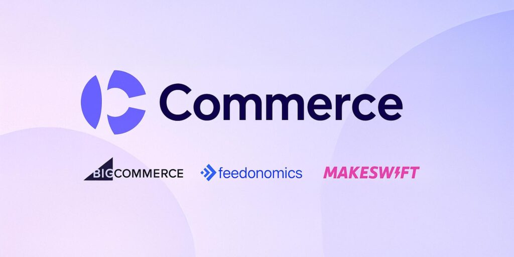
BigCommerce Unveils “Commerce”: Why This New Parent Brand Matters for E‑Commerce
Marketing
,
Paid Media
What’s Next in Paid Media: 2025 Trends and Takeaways for Ecommerce Growth
Website
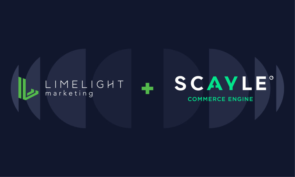
LimeLight Marketing + SCAYLE: A New Era of eCommerce Starts Here
BigCommerce
,
Website
Migrating to BigCommerce Effectively: Five Key Milestones for a Smooth Transition
BigCommerce
,
Website
The Approach to .NET to BigCommerce Migration
BigCommerce
,
UX
,
Website
How to Create a Dynamic Product Bundling Experience in BigCommerce
BigCommerce
,
UX
,
Website
How We Bridge UX, UI, and Dev on BigCommerce Using Tailwind and Fractal
Marketing
,
Paid Media
,
Strategy
Inside Paid Media at LimeLight: Trends, Wins, and What’s Next
BigCommerce
,
Website
How To Install TailwindCSS on a BigCommerce Stencil Theme
Strategy
,
Website
Web & Analytics Trends 2025: What Ecomm Brands Need to Know to Stay Ahead
BigCommerce
,
Website
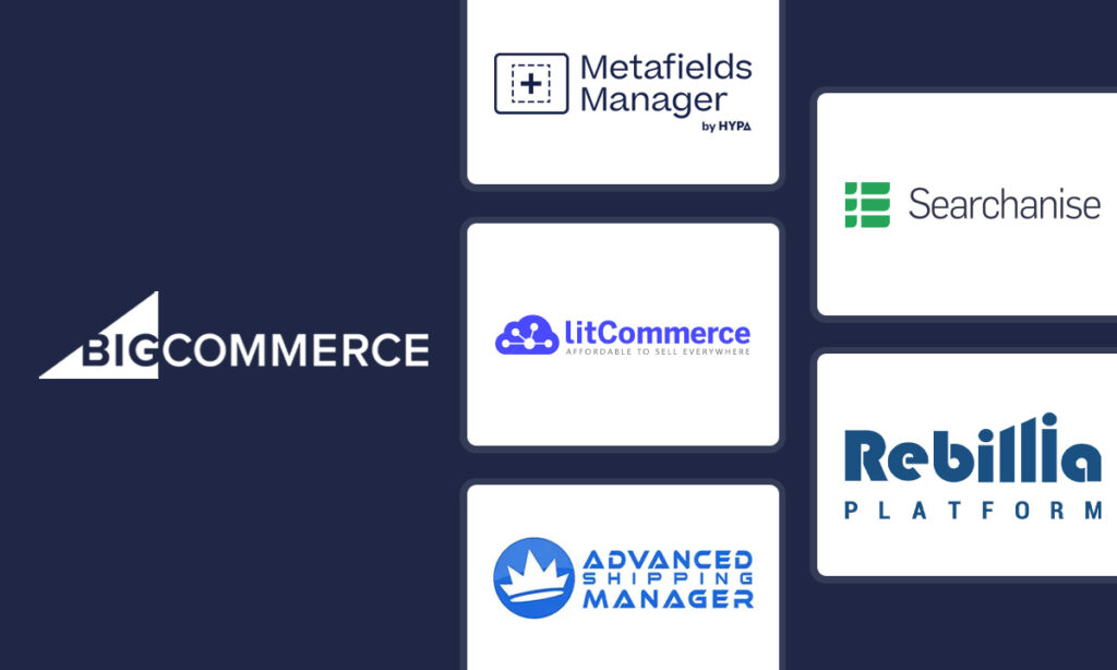
Five Great Apps to Improve Your BigCommerce Storefront
AI
,
SEO
,
Strategy
The Future of Organic Search in an AI World: What E-Commerce Brands Need to Know
BigCommerce
,
Website
5 Killer BigCommerce Features for Enterprises
BigCommerce
,
Strategy
,
Website
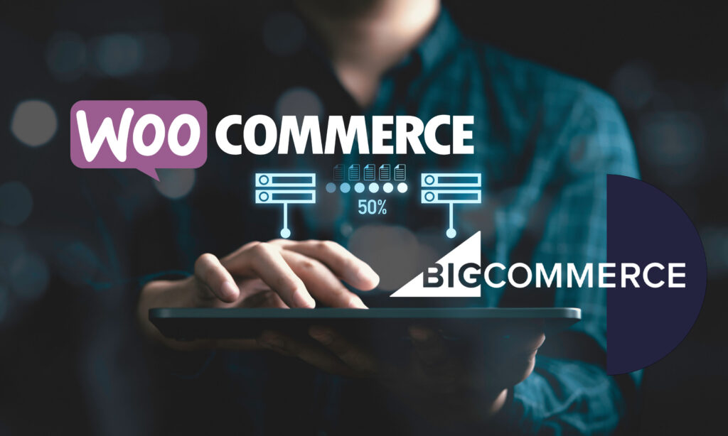
WooCommerce to BigCommerce Migration: 5-Step Process
BigCommerce
,
Website
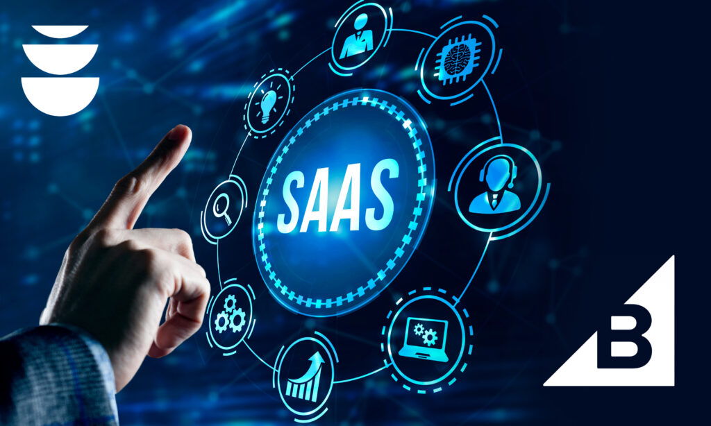
BigCommerce Cost Reduction: Lower Your Total Cost of Ownership with SaaS
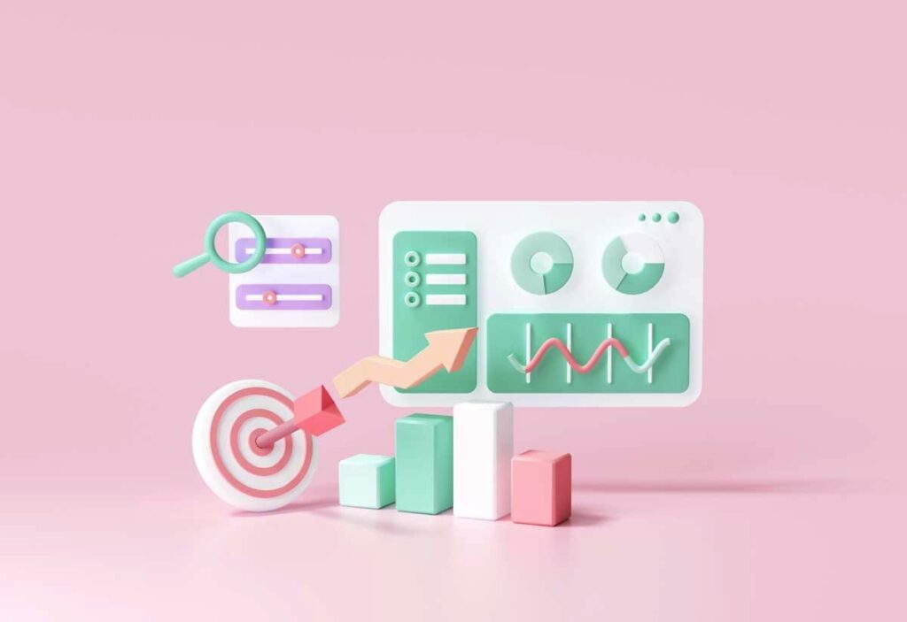
Strategy
Driving Ecommerce Revenue Through Predictive Analytics
Website
How to Justify the Cost of Your Ecommerce Website
BigCommerce
,
Website
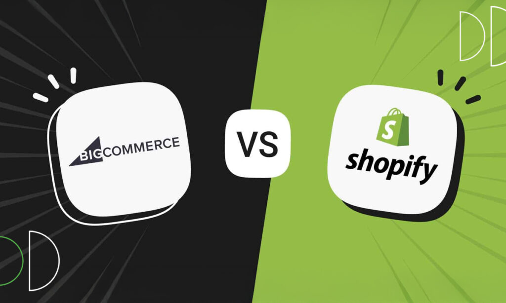
Making the Right Ecommerce Platform Choice: Shopify vs BigCommerce
Marketing
,
Paid Media
How Long Will It Take to Show ROI on Paid Media Campaigns?
Brand
Rebranding for a New Year
AI
,
Website
Using AI to Optimize Ecommerce Search: Beyond Basic Product Discovery
AI
,
Strategy
Beyond A/B Testing: AI-Powered Experience Optimization
Marketing
,
Strategy
Dynamic Content Personalization: Creating Ecommerce Experiences That Convert
Marketing
,
Strategy
The Power of Starting with a Marketing Roadmap: How Strategic Planning Drives Success
Website
Future-Proofing Your Store: How Shopify Empowers Growth in 2025 and Beyond
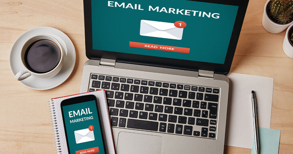
Email Marketing
Migrating Email Marketing to Klaviyo: Why 2025 is the Year to Switch
Website
5 Red Flags It’s Time to Migrate from WooCommerce to Shopify
Email Marketing
,
Marketing
The Real Impact of Email Marketing on E-commerce Revenue
Marketing
,
Strategy
Scaling Your Ecommerce Business From $20M to $100M
Marketing
,
Strategy
How to Audit Your MarTech Stack: A Strategic Guide for Growth
Marketing
,
Strategy
Creating a Cohesive Commerce Customer Experience: Strategies for Success
AI
,
Website
We Tried OpenAI Operator—Here’s What Ecommerce Brands Need to Know to Succeed in the Age of AI Shopping Agents
Brand
,
Content Marketing
When to Invest in Animation: A Strategic Guide to Video Content ROI
Brand
How to Create a Consistent & Distinctive Brand Voice
Brand
10 Signs Your Brand No Longer Reflects Your Business (And How to Fix It)
Brand
When to Update Your Brand’s Visual Language
AI
,
Brand
AI in Creative: A Strategic Guide to Blending Artificial and Human Intelligence
Brand
How to Build a Purpose Driven Ecommerce Brand in 2025
Marketing
Adobe’s 2024 Holiday Shopping Forecast for DTC and B2B Brands
AI
,
Marketing
The Future of Ecommerce: Reflections from Retail Summits
Marketing
,
Strategy
Navigating the Impact of the 2024 Presidential Election on Holiday Shopping: Strategies for Ecommerce Success
Marketing
Expectations of 2024 Holiday Shopping
Marketing
,
Strategy
Is Fragmented Data Holding Back Your Ecommerce Growth? Here’s How to Unify It for Actionable Insights
UX
,
Website
Is Your Ecommerce Website Leaving Money on the Table? How to Improve Website Conversion Rates
Marketing
Are You Wasting Your Marketing Budget? How to Gain Clarity on Marketing Attribution and Optimize Your Media Mix
Website
Ensuring New Websites are ADA Compliant
SEO
Google Merchant Center Overview: Optimizing Your Free Google Shopping Listings
UX
,
Website
Guide to CRO: How Implementing Simple A/B Tests Can Accelerate Your Ecommerce Sales
News
LimeLight Marketing Wins 4 Silver ADDY Awards
Marketing
,
Paid Media
Types of Paid Advertising to Boost Your Ecommerce Business
Marketing
The Art of Customer Nurturing: Building Lifelong Relationships Beyond the Sale
Marketing
Navigating Recurring Revenue Replenishment Flows vs Subscription Models
Email Marketing
A Comprehensive Guide to Email Welcome Flows for Ecommerce
Marketing
How Many Marketing Agencies Should an Ecommerce Brand Work With?
Email Marketing
Google & Yahoo Sender Requirements – What You Should Know as an Ecommerce Email Marketer
Marketing
,
Strategy
What to Do with Your New Customers from Q4
Marketing
2024 Ecommerce Trends and Predictions
Marketing
,
Strategy
Benefits of a B2B Ecommerce Marketing Strategy
AI
Midjourney Prompts and You! Learn to Love Your AI Robot Overlords
Content Marketing
How to Write Persuasive Product Descriptions that Sell
Email Marketing
High-Converting Email Templates for Businesses
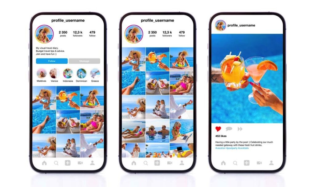
Social Media
It’s Time to Split Your Strategies on Instagram
Marketing
2023 Holiday Season: Setting Your Ecommerce Shop up for Success
SEO
,
Website
SEO Tips for Shopify Sites: Guide to Getting Your Shop Found Online
News
LimeLight Welcomes Two Esteemed Governors
Paid Media
Navigating Shopify Payments: Challenges, Setup, and Opportunities for Ecommerce Businesses
Marketing
Is Formality Dead? The Debate on a More Casual Client Engagement
Social Media
How to Create a Content Calendar
News
Team Retreat 2023: The LimeLight Challenge
News
Proud to be the 2023 Pittsburg Employer of the Year
News
LimeLight Marketing is a Kansas Woman-Owned Business of the Year
Email Marketing
The 7 Essential Email Flows for Ecommerce
SEO
,
Strategy
,
Website
Why Your Ecommerce Site Needs a Technical SEO Strategy
AI
How AI is Disrupting Ecommerce and What You Should Do About It
Email Marketing
How to Turn Gifting and Discount-Driven Customers into Repeat Customers
AI
,
SEO
AI on the Rise: How SEO & Content Will Be Impacted
Marketing
Finding the Positive in Procrastination
Brand
Are Brands Afraid to Get Weird Now?
Brand
My Personal Customer Journey with Cuts, the Athleisure Brand for the Sport of Business
Brand
Liquid Death: How Brand Positioning Made Canned Water Worth $700 Million
Marketing
How We Would Improve Wrexham AFC’s Ecommerce Site
SEO
Google Analytics 4: What You Need to Know and How to Prepare
News
LimeLight Marketing Makes the Inc. 5000 List
Marketing
Changing Ecommerce Trends: What Can Brands Expect for 2023?
Website
Signs You Need a Website Redesign
Content Marketing
How to Repurpose Your Existing Content Using Video
Content Marketing
Developing a Video Content Marketing Strategy
Strategy
,
Website
How to Develop a Successful Website Redesign Project Plan
Social Media
Tips for Developing an Effective Social Media Content Strategy
Paid Media
How Google Ads Can Help Advance Your Business Goals
Marketing
Sending GTINs from BigCommerce to Google Merchant Center for Product Ratings
Marketing
LimeLight Marketing’s Perspective on Hiring an Ecommerce Agency
Website
Is Your Website ADA Compliant?
Marketing
What is an Ecommerce Agency and Do You Need One?
Marketing
How Free, Fast, and Sustainable Delivery Can Boost Your Ecommerce Business
Marketing
The Benefits of Customer Retention Over Acquisition for Ecommerce Business
Marketing
How to Exceed New Customer Expectations in Ecommerce
Marketing
Why You Should Use Omnichannel Strategies in Your Ecommerce Business
Marketing
How to Nurture Your Loyalty Program Audience
Marketing
,
Website
How to Optimize Your Ecommerce Customer Journey for Success
Strategy
,
UX
,
Website
How to Optimize your Checkout Process for Bottom-of-the-Funnel Conversion
Social Media
Using Brand Advocates to Make Social Media Work for Your Brand
Website
How to Prepare Your Site for a Flash Sale
Email Marketing
Holiday Newsletter: Should Your Ecommerce Site Send One?
Marketing
Helping a B2B Company Generate Leads through their Ecommerce Site
Brand
Why It’s Good for Your Company to Stand for Something
Website
What to Do When Your Ecommerce Site “Breaks” During the Busy Season
Marketing
How to Prepare a Personal Gift Guide for Your Audience
Brand
Activating a Consumer Brand in the Digital Space
Content Marketing
Video Marketing Tips to Boost Ecommerce
Content Marketing
Why It’s Difficult to Find Good Copywriters (and how you can spot one)
Marketing
How & Where to Allocate Budget For Ecommerce Marketing
Social Media
3 Keys to Standing Out on Social Media
Marketing
The Ecommerce Customer Journey: What it is & How to Map it
Social Media
Is Your Social Media Strategy Working?
UX
,
Website
5 Ways to Improve Your Website User Experience (UX) for Niche Brand Positioning
Website
LimeLight’s Website Development & Testing Process
Website
LimeLight’s Website Content & Design Process
Website
LimeLight’s Website Strategy & Site Architecture Process
Website
What to Expect in the Website Discovery Process
Marketing
5 Questions to Ask When Hiring an Ecommerce Marketing Agency
Marketing
5 Reasons to Hire An Ecommerce Marketing Agency
Brand
The Evolution of Logo Design
Marketing
Why Having a Word Of Mouth Marketing Strategy is So Important
Social Media
Lifestyle Brands: A Guide to Social Media Marketing
Marketing
The Customer Journey: What It Is & How To Map It
Marketing
How to Use HubSpot CRM
Brand
Brand Framework 101: What Should Be In Your Brand Guide?
Marketing
Do I Need a CRM System?
Social Media
Influencer Marketing for Lifestyle Brands: A Helpful Guide
Marketing
Got Trade Show Leads? Here’s How To Maximize Their Value
News
LimeLight Marketing Acquires Web and Mobile App Development Firm DevSquared
Marketing
How to Choose the Best Ecommerce Marketing Agency For Your Business
Content Marketing
Ecommerce Content Marketing Explained
Website
How Much Does An Ecommerce Website Cost?
Marketing
How to Create a Marketing Plan for an Ecommerce Site
Marketing
What’s the Difference Between Ecommerce and Ebusiness?
Marketing
The Ecommerce Sales Funnel Explained
Brand
How to Write Buyer Personas
Marketing
What Are the Best Marketing Channels for Ecommerce?
Marketing
7 Tips for Boosting Your Ecommerce Marketing
Marketing
How to Increase Ecommerce Sales
Brand
Selling a Lifestyle: a How-to Guide
Marketing
How Do I Increase My Ecommerce Conversion Rate? (Plus 8 Top Tips)
Marketing
The 15 Best KPIs For Ecommerce
Brand
How to Build an Ecommerce Site Around a Lifestyle Brand
Content Marketing
Why Is User-Generated Content so Important for Ecommerce?
Content Marketing
How to Maximize the Value of Your Video Content
Brand
Best Marketing Videos for Lifestyle Brands
Content Marketing
Different Types of Content for Middle of Funnel Engagement
Content Marketing
The Best Types of Content for Top of Funnel Awareness
Content Marketing
How to Distribute Video Content
Marketing
Is the Marketing Funnel Dead?
Brand
Everything You Need to Know About Custom Logo Design
Brand
The Role of Brand Architecture in Business Identity and Market Success
Brand
Brand Campaigns that Honor & Empower Women (& a Couple that Don’t)
Brand
4 Examples of Successful Brand Storytelling
Brand
8 Ways Storytelling Can Strengthen Your Brand
Brand
How to Tell an Irresistible Brand Story
Brand
What is Brand Storytelling?
Brand
5 Different Types of Logos and When to Use Them
Brand
How to Execute on Your Brand Touchpoints to Enhance the Customer Experience
Brand
What Brand Voice Means and How To Find Yours
Brand
Brand Identity: Logo, Color, Typography, Photography
Brand
Brand Strategy: Mission, Vision, Values & Brand Personality
Brand
The 3 Components of a Brand: Brand, Branding & Brand Identity
Website
Why Buyer Personas Are Important in Website Redesign
Brand
What is a Lifestyle Brand?
Website
How Often Should You Redesign Your Website?
Website
How to Migrate Content in a Website Redesign
Ready for better ecommerce?
Your business deserves infrastructure that supports its ambitions.
Chat with Us


