5 Ways to Improve Your Website User Experience (UX) for Niche Brand Positioning


#1: Let data drive your decision making
Now that you’ve made the decision to narrow your brand focus, you need to update your website. There are two paths that you can take here – you can make adjustments to your current website, or you can completely redesign your website. The latter approach is often tempting. A new brand position brings a lot of excitement – and that can translate into a mindset of “re-launch all the things!”.
On the flip side, your current website might be serving you well. So how do you decide? Use data. Data driven decisions are foundational to UX. If you don’t know what currently works and what doesn’t, you don’t have as good a leg to stand on when making UX recommendations.
There are three types of data we recommend that you use to drive this decision.
#1 – Data from a visual design audit. Does your website currently match the visual look and appeal of other companies that you compete with? If so, there’s a good chance that you have a website that you can build on for your new positioning now. Sure, there may be a few visuals or content blocks that need swapped out, but this effort is typically minimal. When you contrast that with the amount of time and effort it takes to start from scratch, it can make a huge time and cost difference. It’s also very difficult for a company to re-do their own website from scratch, so take that into consideration as well. It’s often worth having a 3rd party conduct a design audit for you, as there will be no bias when it’s done this way. We can help with this! Feel free to contact us for a visual design audit today. Lastly, don’t give into “other website envy”. If your website is designed well and holds up to the competition after an audit, you probably don’t need to fully re-design it.
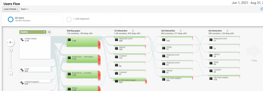
#2 – Data from analytics. You should have Google Analytics on your website. If you don’t, get it set up and wait to make any big changes until you have 60-90 days worth of data. You’ve probably been planning your repositioning for a long time, so waiting another month or two isn’t typically going to be detrimental to your business. This applies to re-positioning, and any other changes that affect website UX – always use analytics to validate your decisions. You may find that the analytics on your current website look really good, and they’ll only get better when you narrow your positioning. On the flip-side, if analytics are weak (high bounce rate, low click through to key pages, etc), it may be time to evaluate if you need a completely new website if items #1 and 3 are also problematic.
#3 – Data from user behavior studies. There are numerous tools out there such as Hotjar or Microsoft Clarity (which is free!) that allow you to generate heatmaps of user behavior on your website, as well as record and watch how users interact with your pages. While it’s not as critical as the other two items, and you don’t have to wait on this data to make your website changes, if you have this already it’s very helpful when paired with your analytics. If you don’t have this type of user behavior tracking now, make it a point to add it to your website when you re-design it or make updates.

It’s worth noting that this principle applies any time you want to make UX changes – whether you’re repositioning or not. Business goals and data should always drive how these changes get implemented on your website.
#2: Evaluate quick visuals before making changes
If you’ve decided to make updates to your current website to reflect your narrowed positioning, one extremely effective way to validate your changes is to visualize them before you make them. This sounds like a no-brainer, but it’s often skipped. Visual language not only ensures that everyone is on the same page, but it also is a quick way to gain valuation that something is in-fact a good idea from a UX perspective. You might think “let’s add a button here” or “let’s add supporting copy there”, and it sounds good on paper, but as soon as you really see it, maybe the UX doesn’t make sense. If the first time you see it is when the changes are live on your website, this can lead to expensive re-work.
A common misconception is that you need to create high-fidelity visual designs to evaluate. This can be time-consuming, and this misconception can lead to skipping this step completely to move as quickly as possible. Your website will suffer if you skip this step because you won’t see what the user is going to see, and therefore make an informed decision about the changes.
There are two ways that you can evaluate visual changes quickly before you make them:
#1 – Wireframes. Wireframes are low fidelity prototypes that help you to evaluate page structure and UX. The goal when creating wireframes is to set them up quickly and iterate rapidly. If it’s taking a long time to make wireframe adjustments, something is going wrong. This should be a process that takes minutes per page, not hours. You can sketch wireframes on paper, or create digital versions in a program like Adobe XD or Axure RP. Below is an example of a page wireframe that only took about 15 minutes to create:
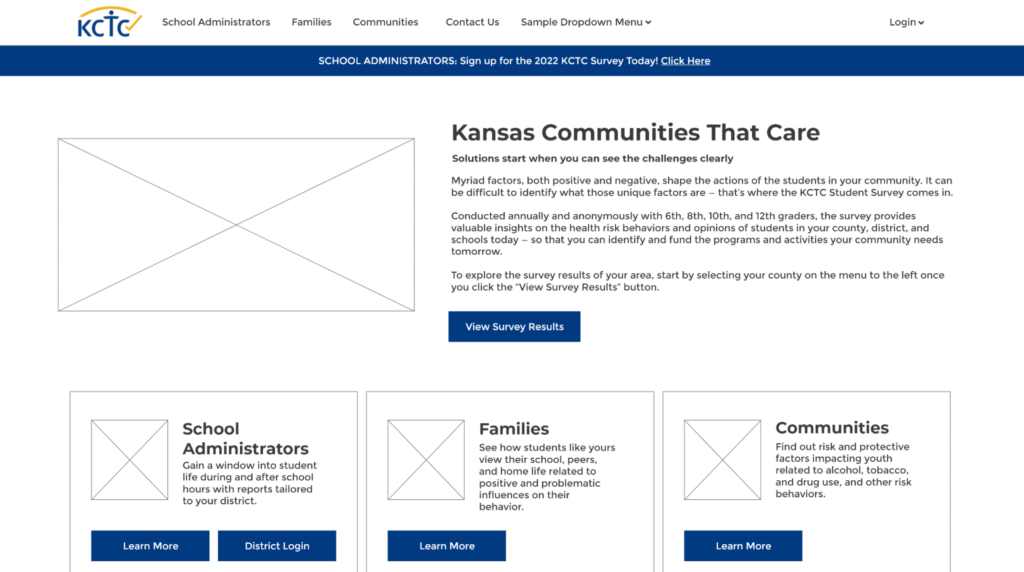
The above wireframe was used to evaluate the UX of the page (related to organizing content more specifically by persona), and was adjusted several times before we landed on the final solution. This was a minimal time investment, with a big payoff.
#2- Low Fidelity/Rough Mockups. If you’re just planning on making changes to your current website’s content and visuals without doing any major redesign, there are some quick ways to validate these changes visually first. This might be adding buttons, swapping out an image, or adjusting content. Sure, your designers could create high-fidelity mockups from scratch, but there’s an easier way for just about anyone to do it. Take screenshots of the current page or pages, and then use a tool like Photoshop, PowerPoint/Google Slides, or even Microsoft Paint to cover up old content with colored boxes and type new content or paste new visuals over old ones. The output of this isn’t anything spectacular or particularly good looking, but it’s easy enough that almost anyone can do it with a tool of their choice, and it’s a *very* fast way to get a visual of your changes to validate the UX.
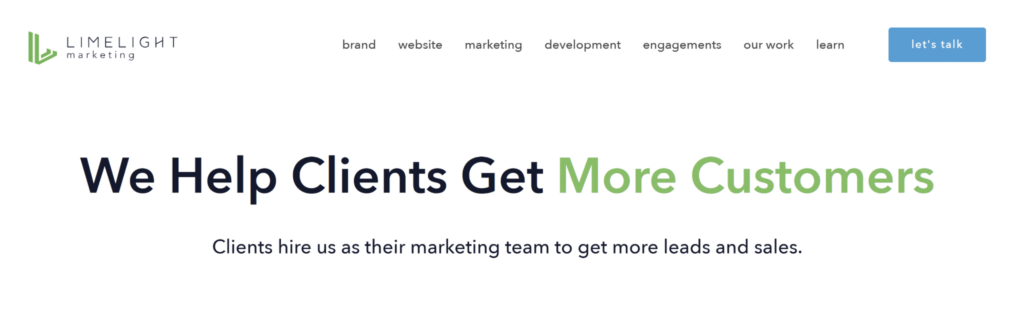
This was the original version of LimeLight’s website before repositioning:
The following low-fidelity mockup was created in about 5 minutes by drawing over the existing website to validate UX changes to the menu, key content, and CTAs. If you look really closely, you can see a different color around the green button – that’s because it’s a screenshot of the button from a different spot on the page that had a different background.
Not sure where your UX is hurting conversions? Our team performs detailed UX audits to uncover friction points.
#3: Simplify navigation and adjust wording
The words you use are extremely important for the UX of your website. While this could be an entire blog post on its own, let’s focus on the impacts of words on your website’s navigation, which will undoubtedly need to be updated as you refine your brand niche.
According to the Nielsen Norman Group in their famous study on How Users Read the Web, “Users detested “marketese”; the promotional writing style with boastful subjective claims (“hottest ever”) that currently is prevalent on the Web. Web users are busy: they want to get the straight facts. Also, credibility suffers when users clearly see that the website exaggerates.”
Additionally, readability is critical, and even experts prefer plain language. In summary, content should be as straightforward as possible, especially in your website’s navigation.
Let’s take a look at several examples below around how using the right words improve website navigation. In the first example, we have a wireframe of a 3 page website’s navigation:
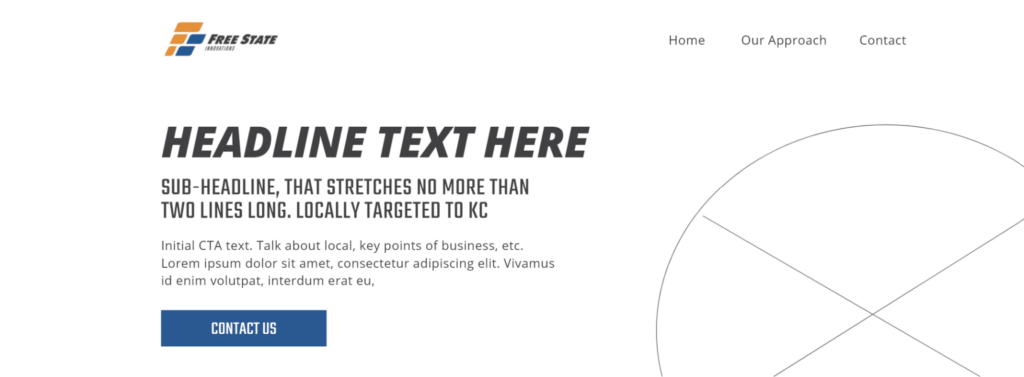
Notice the navigation links – “Home”, “Our Approach” and “Contact”. All of these are very straightforward except “Our Approach”. What does this mean? Is this “Our Process”? Is this “About Us”? Or is it “Our Philosophy”? The ambiguity of “Our Approach” vs “Home” and “Contact” makes the UX here inconsistent. Users should know exactly what they’re getting when they use the navigation on your website, or they may feel frustrated and leave. “Obscure category names often increase the interaction cost because they force people to guess (often wrongly) what the labels refer to. Also, websites with poor labels cause users to make choices that don’t match their goals…”. Source: Avoid Category Names That Suck
It turns out in the above example, the page that “Our Approach” links to really talked about the history of the company and its team members. So in this case, “About” is a simpler term and more consistent with the other two links as well.
Don’t be tempted to use more grandiose terminology. Use what everyone will understand based on commonly recognized terms and existing website conventions.
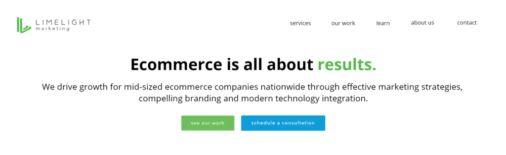
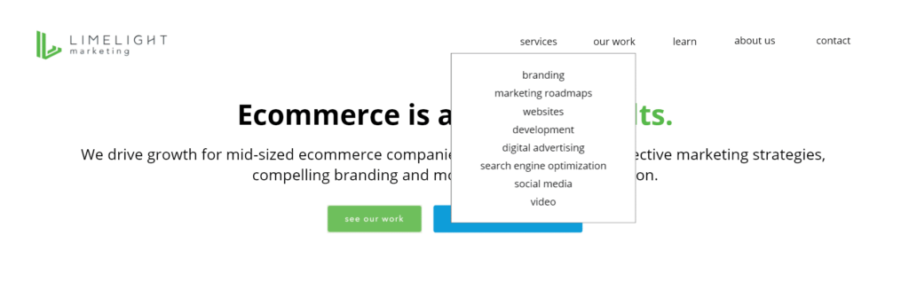
Let’s look at another example. Here we have LimeLight’s old navigation menu:

Note that there are a lot of links, and some ambiguity. “Brand/website/marketing/development” all look like services, so some consolidation may be in order. The fewer things/less ways for a user to get lost, the better. Additionally, the “let’s talk” button sounds like a commitment the user may not be ready for. Will it launch a chat modal? Will it be a contact form? The ambiguity and aggressive language could prevent users from contacting you. When this was written, this probably sounded personable and inviting. While it can be taken that way, it can be taken other ways as well, which is why it’s critical to think from the user’s perspective.
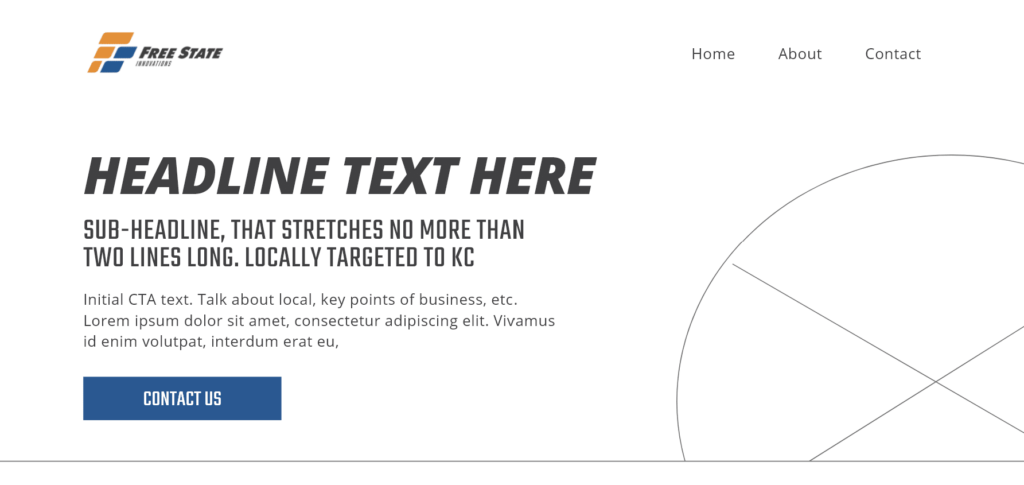
Contrast this with a mockup of our updated menu. Language has been simplified, and items have been consolidated into sub-menus:
Instead of the button with more aggressive language, a “contact” link is in place. Users know that this will take them to a contact form, and that there’s no commitment when they click this link. Also notice the addition of “about us”, which is key. This is all plain language and typical menu structure that people are used to.
Don’t try to do too much with or be too cute with your website’s navigation. This is one of the most important parts of your website, and if user’s don’t find what they expect when they click a link, they’re far more likely to bounce. As the 300 million dollar button example teaches us, simple wording changes can make a huge difference, and changing that “let’s talk” button may be the difference between getting a new customer or not.
If you’re unsure between word options which one is most clear, do a quick survey or user test. This article – Try a Google Survey to Resolve Taxonomy Questions, goes into detail about how a survey can help you to decide which words are the best to use for your website’s navigation.
#4: Anchor your position in your website’s navigation
This is a quick tip, but it is one that is often overlooked. Use a simple statement to anchor your positioning in your website’s navigation. Here is an example:

This generally works best placed next to your logo. Why do this? According to our friends at Newfangled, who are experts on getting the most out of a narrowly positioned company website, “The majority of your future prospects will begin their sessions on your website at lower-level pages, not your homepage. That means you need to make sure your message is as clearly articulated on every page of your website as it is on your home page. Your positioning copy must be visible everywhere.” What more visible/global place than right next to your logo in the website’s primary navigation? There are several ways to approach adding this statement to your website nav. Sometimes, sites will leave it off on their home page where there is typically more articulate positioning messaging, and have it showing on every other page (that’s what we did). Other times, it’s always visible, or only visible when the user scrolls down on a page.
Another benefit is that this approach frees up your writers to have more flexibility with headlines on your various pages. For example, without the anchoring statement, we might be forced to write “Website Development for Ecommerce” or “Brand Strategy for Ecommerce” on our service pages. However, since we’ve already anchored our positioning globally, we don’t necessarily have to do that. This allows copywriters to be less repetitive.
Don’t overthink the navbar positioning statement. It should be short and to the point.
#5: Let users evaluate if your changes are effective
Ultimately, we don’t develop websites for ourselves, we develop them for other people. It can be easy, especially when working on your own website, to get into a creative silo where you think something works, but it doesn’t actually make sense to your customers. This could include anything from your navigation structure, to your content, to your CTAs, to your imagery. Almost everything we’ve talked about in this article could be validated by the fresh eyes of people outside of your team.
So how do you go about user testing? Thankfully it’s pretty simple. If you can find about five volunteers, preferably the types of people that you want to sell your product or services to, and have them try out the changes you want to implement on your website (through an interactive wireframe/mockup, or through a testing copy of your website), you’ll get extremely valuable feedback. You should record these user testing sessions, and review them internally with your team when evaluating what changes to make.
Reviewing the results of user testing can be eye-opening
The most important thing to remember when user testing is to stay humble. Sometimes we as the architects of a website think that an idea is really great and will make sense to everyone. That doesn’t always pan out when we review the feedback of completely unbiased users.
Bonus tip: It’s okay to be incremental
So you’ve read the above tips and have a lot of ideas for making changes to your website. This can be overwhelming at first, where do you start? The good news is that you don’t have to do all of this at once. Maybe it makes sense to start by looking at your analytics, or maybe you can start with a positioning statement in your website’s nav. There’s lots of low hanging fruit. Every change you make can improve your website’s UX, and help your audience understand your specific niche and unique perspective better.