The Evolution of Logo Design


Why do you think that companies like to change their logo identity or branding? Most of the time, it is because they want to keep up with new logo design trends as they develop to avoid falling behind their current or emerging competitors. It may be that a company has decided to undergo a sudden and complete rebrand or they have decided to slowly merge into a new brand. Either way, a new logo and/or new branding elements must be created to do so.
We, as consumers, sometimes fail to realize how logo design trends and even brands have dramatically changed over time. From minimalist and flat to the use of various shapes and sizes, the evolution of logos has had an impact on our designs today. The techniques for logo designs have shaped our present understanding of what shapes and symbols should be used. Let’s take a look at how the logo evolution throughout the years.
Logo design trends: a history
Logos have been around in one form or another for several thousands of years. Think about how the Ancient Egyptians branded animals and walls with hieroglyphs to mark ownership, and how the Ancient Romans and Greeks marked their pottery and art to identify the manufacturer. Many great faiths all over the world adopted symbols for ease of recognition and association with people, ideas, and products.
Branding is by no means a new phenomenon. The branding we think of today started evolving in the industrial revolution and the era after World War I, but it has existed since nearly 5,000 years ago when people began trading. During the medieval times in Europe, visual languages appeared as heraldic crests and symbolic signages. Heraldries are associated with design elements that give societal meaning and status. Certain sets of colors and shapes would represent different noble families. These sets of images were combined to create a unique coat of arms for every noble family.
Logo evolution
Over the last century, our lifestyles have gradually become more complex. This has been a period that observed exponential growth in almost every field of work. Print and advertising have also pushed logos to the limelight. In hindsight, becoming memorable to the consumer has become a huge challenge. Let’s take a look at a few major brands, how they’ve evolved over time, and how they’ve followed or even sparked logo design trends.
Logo design trends in the 1970s
The 70s were an era of color and funky letters. Many logos were updated during this time from black and white to bright color. Big block letters were in, and sans serif fonts made appearances throughout many different logos. In this period, a new non-decorative approach was implemented which lowered the standards of a logo’s artistic design to a more simplistic design. The design styles were simplified to integrate the text and image with a pictorial collage.
![]()
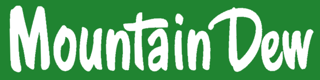
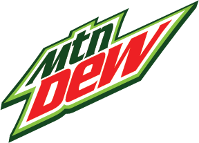
The evolution of the logo in the 1980s
Logos in the 80s became even more saturated with color, and fonts had more of a custom look to them. The logo design trends of this decade included many of the logos having a special or hidden meaning. This era also marked the launch of home computers which allowed more logos to be equipped with a computer-generated feel. Mountain Dew added another color and Doritos added their signature chip symbol.
![]()
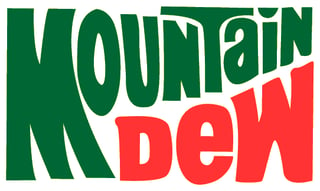
1990s logo design
Throughout the 90s, shapes and color usage in logo designs continued to evolve. A lot of new brands started focusing on their logo design to create iconic logos we see today. Almost every major brand upgraded their logo with icons that related to their business. The icons were used to mark the major features of the logo that have a long-term connection with consumers. They became more simplistic. A popular trend in logo design during this time was adding shapes in the background to add contrast.
![]()
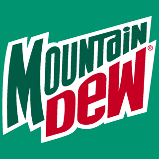
2000s
During the 2000s, brands began incorporating three-dimensional elements into their logos in addition to the simple accent shadowing. In this era, the past designs of logos that had gradients and shadows were either removed or decreased. Brands also went for minimalism to accommodate the mobile revolution. This change improved logos and made them look more like a piece of dimensional graphic art than the simple logo designs of the 1970s and 1980s.
![]()
Logo design trends in 2026
Minimalism still anchors modern logo design, but it has matured. The cold, sterile sans-serif look that defined the late 2010s has given way to what designers now call warm or "neo" minimalism: clean and legible, but with a deliberate detail, a softer color, or a small asymmetry that gives the mark personality. The goal is still a logo that reads instantly on a phone screen, without looking like everyone else.
That shift is partly a reaction to "blanding," the decade-long drift toward near-identical minimalist wordmarks that left a lot of brands looking interchangeable. The correction is well underway. Burger King's 2021 rebrand by Jones Knowles Ritchie dropped its flat blue look for a retro, food-inspired identity with a custom typeface and colors pulled from its own menu. Pepsi followed in 2023 with its first identity change in 14 years, moving the globe back to the center and adding electric blue and black for contrast. Both traded sameness for something distinctive and rooted in their own heritage.
A few other directions are shaping logos right now:
- Adaptive logo systems. Instead of one fixed mark, brands increasingly build a family of coordinated variations from a single core: a full lockup for large spaces, a simplified symbol for an app icon, a horizontal version for a website header. The logo adapts to the context it appears in.
- Motion and kinetic marks. Logos now have to perform in video, social, and interactive screens, so designers build in movement, such as a wordmark that animates on load or a symbol that shifts subtly on hover. The static core stays recognizable while the digital version comes alive.
- Typography-led identities. Bold, custom wordmarks are increasingly doing the work an icon used to do. A distinctive letterform can carry a brand on its own and is harder for a competitor to copy than a generic symbol.
- Human, hand-made detail. As AI-generated design floods the market, visible craft such as hand-drawn linework, a custom typeface, or an intentional imperfection has become a clear signal that a person, and a point of view, stands behind the brand.
![]()
What a modern logo has to do
The reason these trends point the same direction is simple: a logo no longer lives in one place. It has to hold up as a favicon in a browser tab, a round app icon, a line in an email signature, a billboard, and a five-second video bumper. A mark designed only for a business card will break somewhere along that chain.
In the rebrands we work on, the most common problem is a logo that looks great at one size and in one context but falls apart everywhere else. The fix is rarely a full redesign. More often it is building an adaptive system around the existing mark, with a primary lockup, a compact symbol, and clear rules for color and spacing, so the brand stays consistent and recognizable across every screen and surface. For a brand that already has equity in its current look, that is also the highest-return move, because it modernizes how the logo behaves without throwing away the recognition it has earned.
A strong logo is one piece of a brand's larger visual identity, and the right direction depends on the type of logo a brand uses. It pays to review your mark periodically against current standards and against your own brand identity. When a mature brand does decide to refresh, the smartest versions keep a thread of the original so hard-won recognition carries forward.
Trends come and go, but the job stays the same. A modern logo has to be simple, distinctive, and flexible enough to look right everywhere your brand shows up.