As the Creative Director at LimeLight, I oversee the Content & Design phase of our website projects. This article describes this phase and what to expect.
This blog is part of a series that covers each phase of our website process. You can navigate through this series using the links below:
- What To Expect in the Website Discovery Process
- Website Strategy & Site Architecture Process
- Website Development & Testing Process
Recap from Website Strategy & Site Architecture
Leading up to the Content & Design phase, we will have completed Strategy & Site Architecture where we:
- Set goals for the website
- Identified target audience groups for the site
- Created a site architecture
- Finalized a website site map
- Approved wireframes
Keyword research
If one of the goals for your website is being found when people search online for your products or services, then one of the first steps in our content process is obtaining a list of keywords you want to rank for, and performing keyword research. We will advise you through this process on keywords to target based on search volume and keyword difficulty. If the keywords you desire are highly competitive, we may also advise you to consider an SEM strategy.
The deliverable from this step is a keyword strategy for your website that will be applied to writing copy, setting page titles, meta descriptions, and URLs.
Videos, animation & interactive content
If you’d like to include videos, animation, or other interactive content that doesn’t currently exist, it will need to be created or developed early in the content & design process. Sites with these elements often have higher levels of engagement and longer site visits because they can enhance the user experience and provide larger amounts of compelling information without requiring visitors to endlessly scroll.
Spaces for such features can be designated in wireframes during the architecture process, but the elements should be built out in-line with the content and aligned to the style guide to ensure all elements of your site are cohesive and further the user experience.
Content & design
Content and design begin simultaneously, both bringing together parts of keyword research, buyer personas, the sitemap, wireframes, and existing brand elements. If your team is providing content, we’ll ask for that up front prior to moving too far into design. When we create the content, our focus is on providing a flow of information aligned with the wireframes that will resonate with your target audience(s) and pull them through the site experience to become customers.
If your website content isn’t converting visitors into leads, the issue may be strategy, not copy. Let’s discuss it.
Content documents & review
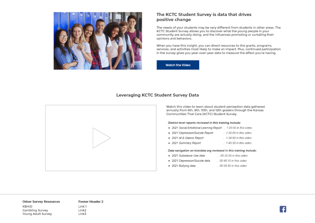
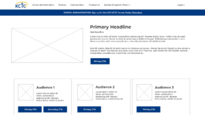
The wireframes will have generic or “lorem ipsum” copy to signify where content will go. The first step in replacing that stand-in content with real content is to create a copy/content document. This document is a Google Doc or Word document that will allow you and us to review the content before it goes into the final design of the site.
In the copy/content document, meta titles and descriptions will be called out, along with headlines, subheads, copy blocks, links, and sometimes images, all organized based on the site architecture. When viewed alongside the wireframes, it provides a 1:1 reference for you to see how the content will flow in your site. Once you’ve reviewed the document and provided feedback, we’ll revise it (if needed) and place the content into the design.
Style guides & high fidelity mockups
Once wireframes are approved, the first step of design is to create a style guide. The style guide details the colors, typography, hover states for buttons and links, and any other critical design elements of your site. This provides a reference point for all designers and developers working on the project, and is essential to ensuring proper design characteristics are applied throughout your site.
Get a Website Content Strategy Audit
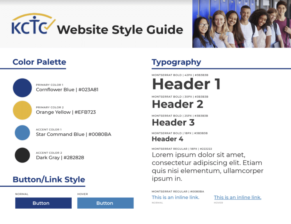
The style guide is always going to be grounded in your brand. If you don’t have established brand guidelines, we can help. The style guide is different from brand guidelines because it only applies to the visual elements and interactive features of your site, whereas your brand guidelines are much more robust and should define your brand logo, purpose, and persona.
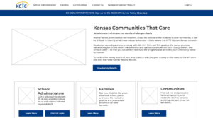
Once the style guide is complete and approved, we will begin creating a high-fidelity mockup of your site by combining these design features with the wireframes. The high-fidelity mockup will also include approved content, so that you will be able see how your final site will look and function for users. As a mockup, it will not have complete functionality, but it will provide an excellent representation of the final look and feel of your site.

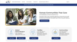
When reviewing the high-fidelity mockup, you should make sure it
- Matches the general organization of the wireframes and site architecture
- Captures the right look and feel for your brand
- Provides content relevant to your target audience(s)
- Has clear, easy-to-use navigation and UI
- Consistently applies design features such as typography and hover states
- Establishes a user experience that makes purchasing compelling and intuitive
If any of these criteria are not met, we will work with you to tweak and revise as needed. Once the high-fidelity mockup is approved, we’ll move into the development and testing process.
