Why do you think that companies like to change their logo identity or branding? Most of the time, it is because they want to keep up with new logo design trends as they develop to avoid falling behind their current or emerging competitors. It may be that a company has decided to undergo a sudden and complete rebrand or they have decided to slowly merge into a new brand. Either way, a new logo and/or new branding elements must be created to do so.
We, as consumers, sometimes fail to realize how logo design trends and even brands have dramatically changed over time. From minimalist and flat to the use of various shapes and sizes, the evolution of logos has had an impact on our designs today. The techniques for logo designs have shaped our present understanding of what shapes and symbols should be used. Let’s take a look at how the logo evolution throughout the years.
Logo design trends: a history
Logos have been around in one form or another for several thousands of years. Think about how the Ancient Egyptians branded animals and walls with hieroglyphs to mark ownership, and how the Ancient Romans and Greeks marked their pottery and art to identify the manufacturer. Many great faiths all over the world adopted symbols for ease of recognition and association with people, ideas, and products.
Branding is by no means a new phenomenon. The branding we think of today started evolving in the industrial revolution and the era after World War I, but it has existed since nearly 5,000 years ago when people began trading. During the medieval times in Europe, visual languages appeared as heraldic crests and symbolic signages. Heraldries are associated with design elements that give societal meaning and status. Certain sets of colors and shapes would represent different noble families. These sets of images were combined to create a unique coat of arms for every noble family.
Logo Evolution
Over the last century, our lifestyles have gradually become more complex. This has been a period that observed exponential growth in almost every field of work. Print and advertising have also pushed logos to the limelight. In hindsight, becoming memorable to the consumer has become a huge challenge. Let’s take a look at a few major brands, how they’ve evolved over time, and how they’ve followed or even sparked logo design trends.
Logo design trends in the 1970s
The 70s were an era of color and funky letters. Many logos were updated during this time from black and white to bright color. Big block letters were in, and sans serif fonts made appearances throughout many different logos. In this period, a new non-decorative approach was implemented which lowered the standards of a logo’s artistic design to a more simplistic design. The design styles were simplified to integrate the text and image with a pictorial collage.

![]()
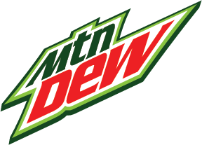
The evolution of the logo in the 1980s
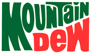
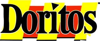
Logos in the 80s became even more saturated with color, and fonts had more of a custom look to them. The logo design trends of this decade included many of the logos having a special or hidden meaning. This era also marked the launch of home computers which allowed more logos to be equipped with a computer-generated feel. Mountain Dew added another color and Doritos added their signature chip symbol.
1990s logo design
Throughout the 90s, shapes and color usage in logo designs continued to evolve. A lot of new brands started focusing on their logo design to create iconic logos we see today. Almost every major brand upgraded their logo with icons that related to their business. The icons were used to mark the major features of the logo that have a long-term connection with consumers. They became more simplistic. A popular trend in logo design during this time was adding shapes in the background to add contrast.
![]()
2000s
During the 2000s, brands began incorporating three-dimensional elements into their logos in addition to the simple accent shadowing. In this era, the past designs of logos that had gradients and shadows were either removed or decreased. Brands also went for minimalism to accommodate the mobile revolution. This change improved logos and made them look more like a piece of dimensional graphic art than the simple logo designs of the 1970s and 1980s.

Current logo design trends 2023
In 2023, trends in logo design are gearing more towards minimalism. Brands are rolling out logos that are more honest and simplified to better resonate with people. Versatility is the primary reason for these simplified designs. With more of an emphasis on digital marketing and mobile devices, it is increasingly important to have logo designs that can adapt to small screen sizes and can capture the attention of the consumer.

It’s important to consistently analyze your logo to confirm that it’s in line with modern trends and reflective of your brand’s identity. If it’s time to updated or redesign your logo, consider the value of maintaining your brand recognition. More often than not, mature brands who rebrand themselves do so in a way that maintains brand recognition by going with a variation of the original design.
Remember, trends come and go. But in a fast-changing world, keeping up with competitors and maintaining a modern and relevant brand is key to success.